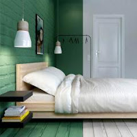
Rather than rely solely on intuition to introduce and arrange the colors in an interior decor, refer to the classical principles of combination used by professional allows to pursue a much more effective approach with much assured results.
Home Decor: Professional strategies to use colors with confidence
Color combination of the principles are based on the color wheel (color wheel).
The color wheel
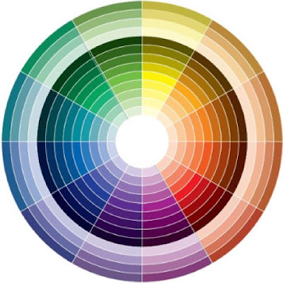
The color wheel has 12 colors
3 primary colors (red, yellow, blue);
the three secondary colors which result from the mixing of the primary colors (orange, green, purple);
and six tertiary colors.
These colors, which no white, gray or black was added, expressed full saturation or pure. Among these 12 colors, can be located all pure colors that can be produced by different dosages of the three primary colors.
The color wheel also includes three types of color shades
colors: color mixed with white;
shades: color mixed with gray;
shadows: color mixed with black.
Combining monochrome colors (tonal)
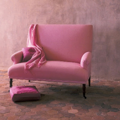
A first color combination strategy is to use a single color declined in different shades obtained by adding white, black or gray.
This simple strategy allows, for example, enhance an already present color in the decor or to create a flow of colors using different tones from one room to another.
The combination of analogous colors
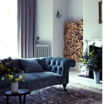
A strategy that adds more shine is to use similar colors, the colors that are close together on the color wheel. A sense of unity is maintained by the similarity of colors.
Interesting effects can be obtained by using different shades (white levels, gray or black) of those colors to combine light and dark shades. For example, a pale pink near a bright orange gives a more contemporary effect as two bright colors close to one another, said Dabney Frake on the website Apartment Therapy.
The combination of complementary colors
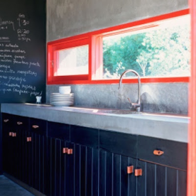
A strategy that adds more shine and contrast is the use of complementary colors that are directly opposite on the color wheel. Thus, the blue works with orange, yellow with purple and red with green.
More colors are directly opposite, they seem more brilliant together, especially when used at full saturation (without adding white or black). In this intense form, it is not necessary to use a large amount of color to create a great impact.
Two color equivalent amount may give an overload effect. It is generally best to choose a dominant color and use the second in focus.